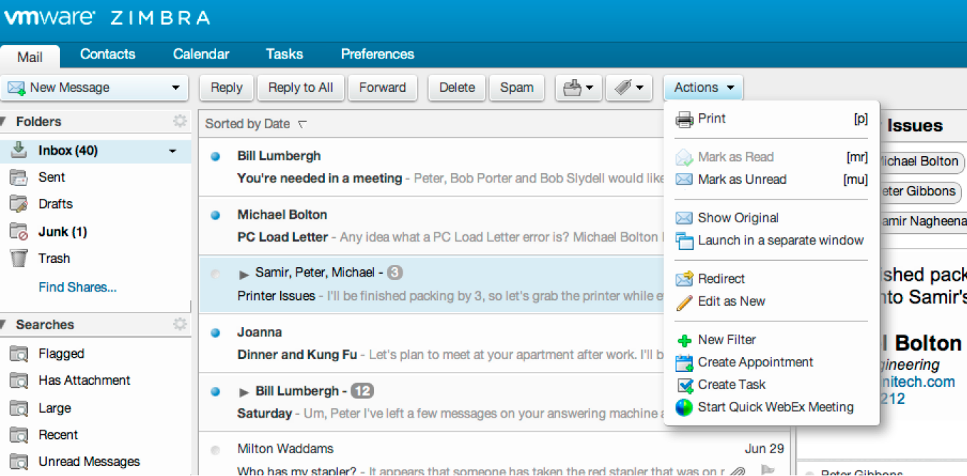
Zimbra users will notice major changes to the user interface in Zimbra 8. What you cannot see is the ‘behind the scenes’ work that went into those changes. Zimbra 8 reflects process and methodology changes that will improve the user experience not only in Zimbra 8 but all releases moving forward.
Usability doesn’t just happen
Until now, the Zimbra user interface has been an organic byproduct of how features were added. And as each new version added more great features, the user interface started to become cluttered.
Simplicity is hard to add incrementally. But starting with Zimbra 8, a dedicated user experience team has focused on the user experience. They’ve created a set of processes to improve usability for all new releases.
A usability baseline
The team started by creating a baseline for Zimbra 7 using formalized usability testing. They looked for tasks where they could save people time or make things easier. For example, tasks that you perform infrequently – such as setting an out-of-office message when you go on vacation – can be difficult to remember how to do for those of us who don’t take many vacations. We’ve made this easier in Zimbra 8 by creating a dedicated out-of-office preference, reducing the number of steps to set up an out-of-office message.
Usability bugs
To elevate usability as an ongoing issue, we defined a class of Usability bugs in Bugzilla, which we will use to track usability issues through releases. This is great for reaching out to the IT leads, but it still left the problem of communicating with those who don’t use Bugzilla.
Reaching out to user communities
To get to those non-IT people, the UI team started actively seeking out power users. For example, the team interviewed executive assistants who schedule a lot of meetings and they found a way to streamline the scheduling of times and resources like conference rooms – that’s another improvement in Zimbra 8.
Visual simplification
The UI team redesigned the interface to eliminate clutter, making it easy to find the most important functions. They moved many secondary functions from buttons to menus.
Zimbra before…
Zimbra after…
Beta testing and feedback
All of this work resulted in many UI changes in Zimbra 8. Some are big and affect everyone while others are smaller and important to a significant group of users.
The UI team continued to do usability testing right through the beta. Within VMware, where everyone uses Zimbra, we set up a social networking group where people can talk about and vote on the issues of most importance to them. And of course everyone can contribute and vote on UI bugs in Bugzilla.
Give us your feedback
If you’re using Zimbra 8, use the Zimbra forum to let us know what you think about the changes to the user interface. We really are listening, and are already working on additional usability changes for Zimbra 9.
In future posts we’ll talk about some of the major UI changes in Zimbra 8 in more detail.


The new interface looks fresh, and efficient. We are planning the upgrade to 8. One feature I’d like to check on is – Does the new version have the option to group emails – into weeks similar to outlook. Emails Today – Emails yesterday – Emails Last week etc. Many of my older Outlook users enjoy this feature.
Thanks!
@Zakaria Desai: Yes, Zimbra supports the grouping of email messages by date. The user just needs to right-click the list header and choose Group By > Date to enable it.
@Josh Johnson What are some of the major changes Users will actually see with zimbra 8 from Zimbra 7.1.4
Some of the most visible changes are:
* The new conversation view which aggregates all the messages into a single view while hiding duplicate text where possible.
* The new search display in its own tab with more visible filtering controls.
* Simplification of the toolbars where they’re generally text or an icon (not both) and where secondary actions are grouped under an Actions dropdown
No IM.
I would like to have the spell check work on the Subject line of new emails.
Be able to move copies of a an email to different folders.
@robin: Zimbra 8 supports integration with existing standard Instant Messaging systems. Here’s a quote I stole from Jon Dybik that explains it better than I can.
What we offer today in Zimbra 8 will be presence and click2chat launching the local IM client. Click to chat will launch whatever chat client is registered to respond to well known chat URI’s such as IM:// or xmpp://. With Cisco, for instance it will launch the local Jabber client. On my MAC, I’m running Mountain Lion as have it setup to launch the local Messages App.
@Marc Baranski: We have an existing enhancement request for spellchecking the subject (http://bugzilla.zimbra.com/show_bug.cgi?id=12352) so feel free to vote for it. Also, holding the shift key while dragging a message to another folder will copy the message into that folder.
Zimbra 8 should be like LinkedIn
– Email is just a part of the conversation
– Most of the conversation happens by hastags and posting
– creating collabrative workspace should be the major part of zimbra with email as tab