Want to know more? Want to be an even greater part of Zimbra’s next generation of products? Please sign-up to request an invite to the beta program.
Thank you! Your Zimbra friends & colleagues
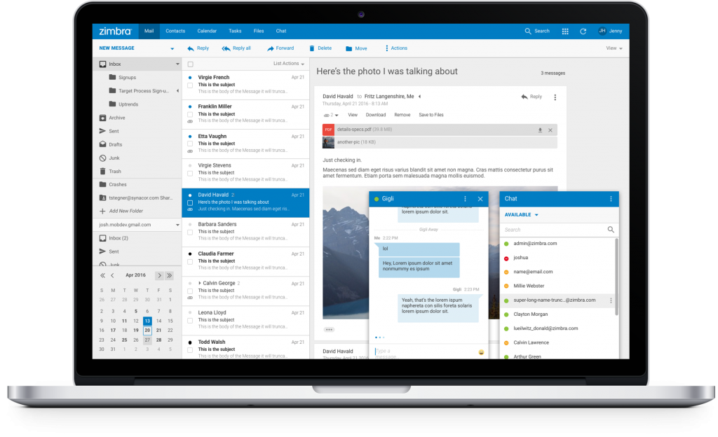
During our first COMMIT, a Zimbra tech and developer event, we presented the new Universal UI: a re-designed user interface for Zimbra Collaboration that includes modern standards and improves the user experience.
Try the new Universal UI – Cloud Based
You can try it today without install anything! Click the link below, follow the instructions, and in a few minutes you will receive a Zimbra Login URL, username and password. Do any tests you like: import an old .tar.gz from another demo Zimbra account, send or receive emails, create appointments or contacts, etc.
Try the New Universal UI – Build
If you are an active Developer, or if you want to test the new UI with your Zimlets or your own developments, we have a build for Developers. Please do not use this build in Production. Zimbra Support does not offer support or advice about this build.
Improved Features
The Zimbra Universal UI was built to preserve the Zimbra essence and know-how while improving the functionality and the overall user experience. Many improvements now provide a better experience to users in a much more intuitive interface.
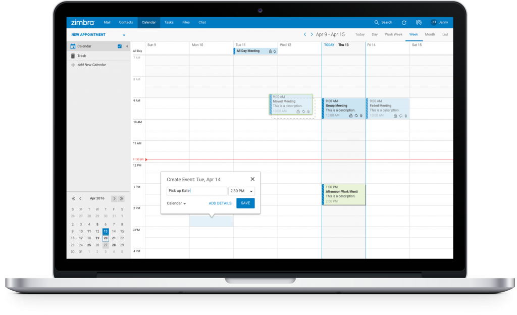
New Calendar View
The Calendar view was redesigned with a modern and fresh appearance. One of the highlights is the new way to quickly add events, without popups, to improve user efficiency.
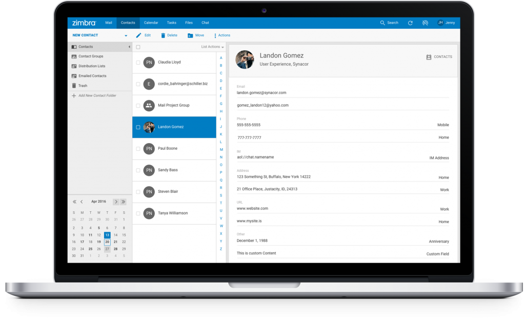
New Contacts View
For the Contacts view, we offer a more modern avatar display. If the user doesn’t have a picture yet, Zimbra will show the initials of the contact.
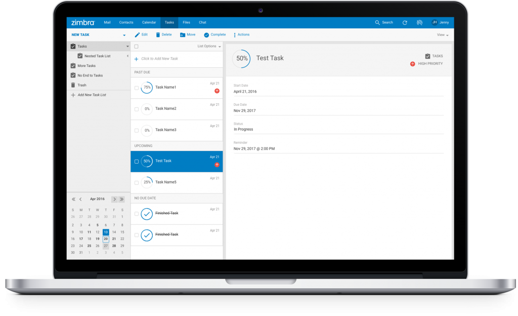
New Task View
The Task view shows a modern and fresh view of the Task status by changing the progress bar into a progress circle.
Zimlets: The Crown Jewel
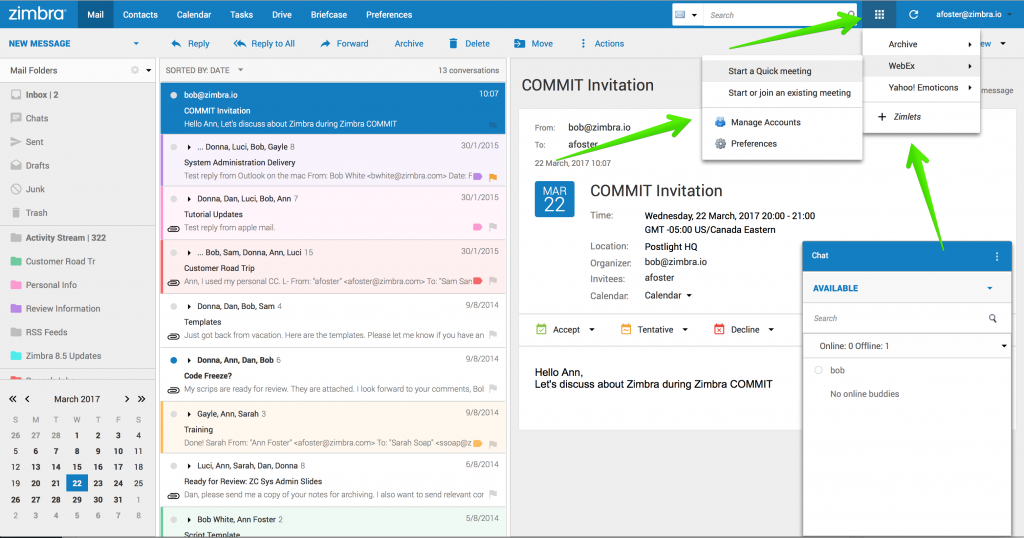
Our Zimlets are, without a doubt, one of our biggest assets. Now they are at the top of the menu bar, where users can locate their Zimlets faster and interact with them with less effort/fewer clicks. This change shows Zimbra’s commitment to our Technical Partners and Developers who build extensions and Zimlets for Zimbra while we continue to improve the product at the same time.
From the Product Team, we hope you can take a look at the Cloud version. Please give us your feedback in the designated Forum.

When I click “Try Cloud” and enter my email address, I get redirected to “403 Forbidden
nginx”. :-(
I requested 2 times access to the Zimbra Universal UI – Public Beta
i didn’t receive anything
I did sent to you the emails, they might went to your SPAM or so, but I’ve sent to you directly now, check them :)
Looking forward for your feedback
I was able to log in once I stopped receiving the nginx error; thanks! (Amusingly, the message was delayed by a a slow retry from your server when the first connection attempt was greylisted by postscreen.)
BTW, you have a typo in your HTTP->HTTPS upgrade remap; the blog sends out notifications with links like “http://blog.zimbra.com/2017/03/zimbra-universal-ui-public-beta” and those get remapped to “https://blog.zimbra.com2017/03/zimbra-universal-ui-public-beta” — there is a missing “/”. You should fox this and consider enabling HSTS.
Is it possible to get access to download the UI? It seems that my request isnt accepted. I have signed up a few times.
Hi – the Beta program is now closed. Stay tuned for more about an upcoming new Zimbra look.
Looking good … now if we could only get some more SOAP integration hooks going :)
Will this be provided for Zimbra Desktop users too?
ZD is currently languishing and looking decrepit – with not even the Serenity theme available! :s
P.s. The theme new interface does look great though!
It would be good to have the A-Z bar in contacts on the left hand or right hand side rather than floating centralised at the top of the contacts pane; and it would be great to see thumbnails of the contacts in the contacts list, rather than just upon opening the contacts.
It’s getting there, but you guy’s have obviously just been focusing on just migrating what was already working fine in the “plain” HTML version (which is very broken when you try and switch to it from this demo btw), into a “web-app”…. same old func!
What you SHOULD have been doing is building the REST API so people who “do” front-ends can do that and just pull in the “stuff” as is required – appreciate you have the network accounts to look after and keep sweet, but this is just window dressing – the real problems you have are in moving the product forward in terms of functionality and ease of integration into other apps. Take a look at what WordPress has done, it was about to begin a slow death as other platforms were offering more up-to-date tech, e.g. REST APIs, so they saw that and moved pretty quickly for such a behemoth and built the REST API which has completely changed WP, and has now opened up a whole new way of dealing with ti.
Unless you guys get that sorted urgently, this product will be dead within 2 years, max, as others come along and eat your lunch….
… and btw, the “web app”‘iness of the thing doesn’t work properly, just adding incremental #’s gets wiped out when you move to the preferences, which breaks all the browser history – you should be leveraging the HTML5 / js browser history which is already present and accessible in most browsers…
… and finally, reading what the chap above said about the desktop app, again, if you had a decent REST API, you could toilet whatever you’re using atm, and rebuild it in Atom Electron super quick and have a cross platform desktop app running in no time…..
Hi Rupert, we can’t be more in agreement :) That’s exactly our plan, with this new UI we will accomplish what you are describing with our new REST APIs, but meanwhile that moment came we wanted to build how the look and feel will be with that new UI. What you are seeing here it’s more than a theme for the actual webclient, we are changing at code level how things were built.
Once we have the new API ready, we will have a new Client using those API, but the look and feel and experience will be pretty much like this one.
Or if you want, we are using internally Universal UI (Phase 1 – Clarity) For this work on the actual web client using SOAP API, and Universal UI (Phase 2) where is a new client using new API and React, Angular, etc.
However, you can find examples of Partners using the approach of a middleware and an API here – http://vnclagoon.com/products/vncuxf/ and here you can see it working https://youtu.be/XdoNfaUw1kM?t=1806 built in using Angular. If you have an immediate need, please contact them.
Thank you for your comments and for using Zimbra Rupert, appreciate all the comments.
@Jorge, that’s all very well, but my point was that if you don’t get your REST API up and running as a matter of urgency, then the whole platform is at severe risk, as people like me explore other other options that have a working REST API – NO ONE uses SOAP these days, its dead tech! Yours is legacy tech, and should have been identified as such and prioritised long ago.
Not wanting to name your competitors openly, but they are out there with fully functioning, beautifully documented REST APIs, and they honestly put you guys to shame.
I’m clinging on by my fingernails with Zimbra, as I like the admin/back office, but am seriously investigating one of your biggest direct competitors, and I’m not even touching on google, as they’re a different proposition.
There’s poor communication on the part of Zimbra, too – there’s a non-existent road map, and although I have asked in the past about even a vague timeline for the REST API, I have had no joy.
Someone there needs to address this urgently, otherwise, as I suggest, you are going to be losing a lot of highly innovative companies, who, once they have made their choice, aren’t going to migrate any time soon, and the current customers/user you have are going to be demanding the new features built by these innovative firms…. not on Zimbra….
Any news on the state of the REST API would therefore be very welcome.
PS: your email reply links are broken, there’s a “/” missing after zimbra.com …..
Are you a Network Edition Customer? I can’t find anything by the domain on the comments. Did you raise these concerns to your Sales representative, or your intention to move? I will ask for a date to share with Customers and Partners for the API’s, which we are currently deploying on some big accounts at the moment.
SOAP API are used by VMware, even in recent versions, and we have a lot of Partners building on top all kind of integrations, I’ve seen an Admin Console, and integration with SMS, a new UI and much other deployments.
As said before, it’s a priority for us and we are already addressing this issue and much others our Customers are demanding to us, for that reason, if you are a Network Edition Customer, before move, or think of moving, please raise your concern to your Sales Representative so we can take your notes into the prioritization of the APIs as well.
Let me discuss with the Product team so we can come back with a clear timeline on the APIs, thank you for your comments Rupert, have a great day.
Hi,
Any timeline on when this new UI will be available in GA ?
I’m in the process of preparing a major upgrade of our Zimbra (7.2) to a new installation with the current release but I’d be happy to start directly with this new UI instead of the current one which is just a little refresh of the one I have on 7.2.
Hi Walid,
This UI will be included as a beta soon, inside the product. As GA, we are targeting September.
Best regards
it’s seems to be great, i will try then :)